

Series (II): T20 cricket to diversify bankroll deployment
Part 2: Starting with teams

We left off last time with a laundry list of observations on the similarities between cricket and baseball as a means of establishing some foundational understandings of how to go about handicapping. I may have zero familiarity with cricket but some concepts and understandings are standard across all modeling, and some from a similar sport can serve as a helpful reference point.
Today, we’ll get into it with some numbers using real data sets to help understand the overall shape of T20 cricket; how its stats look and feel, what we might need to do with the raw data to unlock applicable techniques from other sports. We’ll start to develop additional metrics and data transformations we can use to originate our own model. Let’s start with the highest level data possible: the humble box score, which just tells us what the score of the game was.
Scoring differential is a simple yet powerful metric that is used across a lot of sports to gauge strengths of teams against one another. We can derive all sorts of formulas from scoring differential, from the simple Pythagorean expectation of a team’s win/loss record to more complex algorithms like Elo or Markov chains to convert scoring differential into steady-state team rankings. Scoring differential across multiple games can also tell us something about the behavior of the sport as well.
When evaluating scoring differential for a given sport, I like to start with looking at the distribution of scoring differential to get a high-level sense of the sport. Distributions are the expanded version of stats like average and median; they give a complete picture of what outcomes of the sport can look like. I prefer distributions over simple summary stats because they can provide key context that simple averages can’t. The classic example in football, where scoring differential disproportionately occurs with values of 3 and 7 due to the quirks of how scoring works in that sport.
Here, for example, is what the distribution of run differential looks like between the home team and away team for baseball:
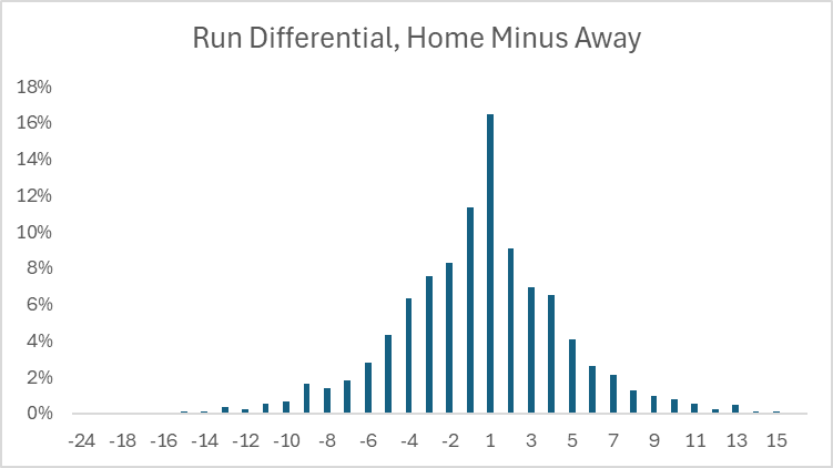
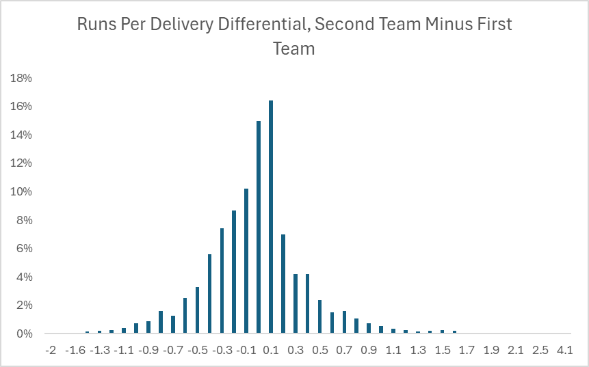
This more or less resembles a normal distribution, which has consistent and stable properties to unlock all sorts of analyses and formulas. By contrast, here is how the scoring differential looks like for T20 cricket games, where instead of home versus away, we use second team to bat versus first team to bat (functionally the same thing in baseball, since the home team bats second):
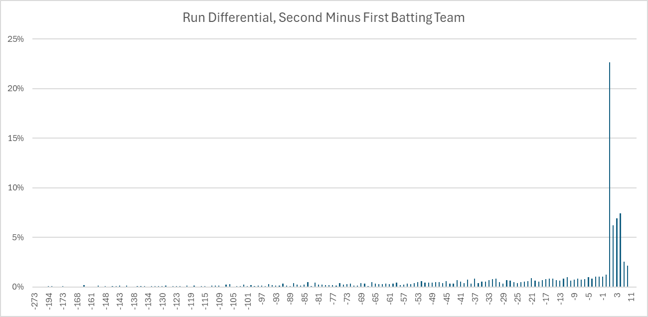
Right away, we can tell that a simple run differential distribution doesn’t do a good job of explaining the intricacies of cricket scoring due to how clustered the results are. Isn’t it weird that when the second batting team wins, it’s almost always by one run? It’s not actually weird, it’s a reflection of the rules of the game.
Recall that in cricket, the first team bats in their entirety, they stop when the other team gets 10 outs or bowls 120 attempts (simplified), and if the second team exceeds their run total when they go up to bat, the match is over. This means that our usual concept of scoring differential needs to be adjusted, because one of the implicit assumptions of scoring differential is that each offense is provided equal opportunities for production according to the rules (in sports like football, things like dominating time of possession can limit scoring opportunities for the opposing offense, but all else being equal, both teams are given the same opportunities to control time of possession). So what can we do to the data in order to make it work a little nicer?
Given the caps on offensive opportunities (max of 120 deliveries, ending the game if the second team exceeds the other team’s runs), we are much better off utilizing rates, aka scores per opportunity, in order to get a clearer picture. Coming up with a good rate metric is a challenge in its own right because of how cricket scoring works, especially compared to other sports. We’ll dive into each half of our potential rate, aka the numerator and the denominator, to see if we can come up with some distinct summary stats that we think will have some predictive power when we eventually feed them into a model.
The Numerator: Not All Runs Are Created Equal
Runs in cricket come from two places: runs created by batters hitting the ball around the field (known as team runs), and runs created when the bowling (aka pitching) team commits rule infractions, like the bowler overstepping the crease. These penalty runs are known as extras. It will be good to understand how often runs come from batted runs versus extras to help prioritize our analytical focus. This is another great application of using distributions- we can look at the distribution of what percent of total runs extras comprise of a team’s score.
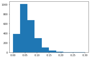
Extras are typically around 6% of a team’s total runs, but can be as high as 30% of a team’s total. This is another example of how distributions can tell a story that simple averages can’t. If we just took the average of 6%, we might conclude that extras aren’t all that important to account for. But when we see that in 10% of the games, extras account for 10% or more of a total team’s runs, that’s a significant enough threshold to warrant specifically accounting for extras. (As a side note, there’s no hard and fast rule for analyzing distributions like this and determining significance thresholds- a lot of that judgment comes from repetition and experience slicing and dicing sports data.) So at a minimum, it’s worth our time to separate out extras from batted runs.
Runs that come from extras feel like they should be flukier and noisier than runs that come from a team’s bread and butter offense. Maybe there’s something to be said about a batter’s ability to induce extras (does he require more aggressive deliveries that risk inducing extras? Is he particularly good at capitalizing on no-ball situations where he essentially gets a free crack at the ball? etc), but a reasonable starting assumption is that runs that come from extras probably shouldn’t be attributed to a team’s offensive capabilities. Conversely, runs allowed from extras might have a little more predictive power. If a bowler is consistently wild in their deliveries, we would expect them to give up more runs from extras over the long term than a bowler that has more stable and consistent deliveries. In other words, runs allowed from extras is a lot more within the control of the bowler than runs scored from extras is within control of the batter. Fortunately, the cricket data set we’re working with already separates out team runs from extras, so there’s not a lot of additional work we have to do.
The Denominator: What Determines Opportunity?
The first team to bat in cricket stops batting when they record 10 wickets (aka outs) or when they receive 120 deliveries. Having a sport where there are multiple conditions for the offense’s turn to be over is particularly interesting: it’s roughly equivalent to one half of a baseball inning being over after 3 outs or if 15 minutes has elapsed. If we need to use offensive rates of production, then what should the denominator be? runs per wicket? Runs per delivery? Both? Neither? We can at least size the problem by seeing how often an inning in T20 cricket ends under either condition to see where we need to focus our efforts.
Let’s start by trying to understand what the distribution of wickets fell for the first batting team looks like. We focus on the first batting team, because they are afforded a more consistent set of batting opportunities under the same conditions each time, as opposed to the second batting team, which has their opportunities capped once they meet their target run score.
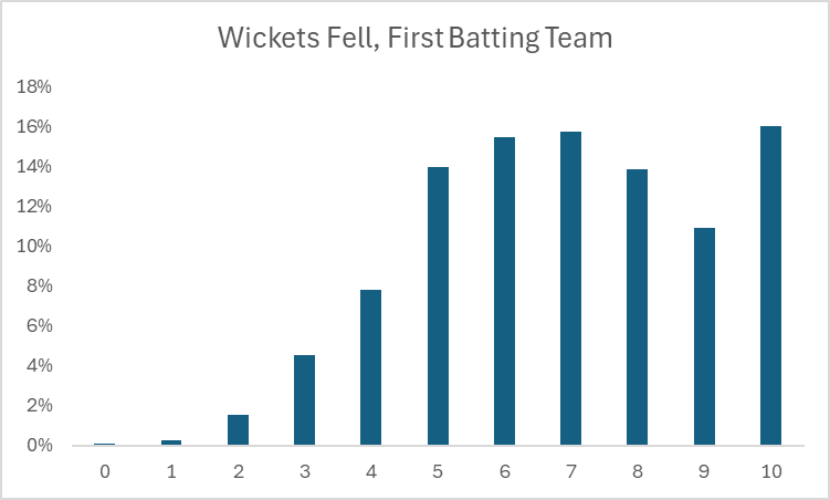
T20 cricket is all-or-nothing for the first batting team with respect to their wickets: 8 wickets is the same as 2 wickets, because deliveries are capped at 120, so we can reduce this to “how often does the first batting team stop after 10 wickets”?. This turns out to be about 16% of the time, enough that it matters to account for. As a starting point, the default assumption should be that the first batting team will receive a full 120 deliveries since it happens the majority of the time, which lends us to using deliveries as the default opportunity rate. We will eventually have to account for cases where deliveries are cut short by all 10 wickets getting felled, but even though it happens frequently enough that it will affect our predictions, we can more or less treat it as an exception to start.
Our Metric Of Choice
Now that we’ve settled on team runs scored as the numerator and deliveries as the denominator, we’ll calculate the runs scored per delivery for each team in each match and see what the distribution looks like of that metric across all matches.
Something familiar finally! This is much closer to our expected baseball distribution, so hopefully we’re on the right track transforming the data into something we can actually feed into our models. In the next article, we’ll start to get more granular on team runs scored at the batter level and start to slice and dice where batter runs come from, and see what other baseball concepts we can start utilizing.