

Series (V): T20 cricket to diversify bankroll deployment
Final chapter and code

In the last couple of articles, we’ve done some exploratory analysis on some cricket stats to help us understand player performance. Today, we’re going to use those metrics we created to build our very first model and see how it performs.
To recap, we’ve identified a couple of per-delivery metrics for both batters and bowlers. Batter metrics are as follows:
Runs per delivery: a base rate of a batter’s offensive contribution
Average number of deliveries: a measure of a batter’s longevity in their at-bat
Fours rate: how many fours per delivery a batter hits
Sixes rate: how many sixes per delivery a batter hits
Bowler metrics are as follows:
Runs per delivery allowed: how much offense a bowler allows
Wide rate: a metric that shows a bowler’s propensity to give up extras
Fours allowed rate: how often a bowler gives up fours
Sixes allowed rate: how often a bowler gives up sixes
Wicket rate: how often a bowler fells a wicket per delivery
In order to utilize these metrics in a predictive model, we have to put ourselves in a simulated position where we’re trying to predict a game in front of us. If two teams are about to play each other, we have to calculate a historical record of these metrics for all of the players that will play in this match and encapsulate these historical averages into single numbers for each player. We’ll use a simple rolling average of the last 10 matches for each batter and bowler to calculate their averages for all of these metrics as the base inputs to our model.
Model selection is a much more expansive topic than the scope of this series: there are numerous tradeoffs between simplicity, interpretability, accuracy, and computational cost for all the different modeling approaches out there. The main usefulness of our first pass model is developing some better intuition on the predictive power of each of these metrics, so if we’re less concerned about matching the modeling approach to the specifics of the sport (aka no simulation of outcomes required), one approach is to just toss all of these metrics into a black-box non-linear model and see how it ranks each of these features in terms of their importance. XGBoost is a popular model choice: it leverages a lot of advancements in computational architecture to generate all kinds of predictions that fit non-linear relationships in data very well. This is a sensible model choice for our first pass, but in order to utilize this, we need to make sure we are setting up our data set correctly in order to get meaningful predictions.
One of the biggest sources of bad modeling techniques is overfitting, where advanced knowledge of the outcome accidentally leaks into the data set, and the model overfits to features or data points that accidentally correlate strongly to the leaked outcome, but don’t have as much predictive power in out-of-sample observations. This can happen in sneaky ways that sometimes don’t appear to be overfitting. For example: in the data set we’re working with, the results are listed in terms of Team 1 and Team 2, but upon inspection, these are not randomly assigned orders: they are specifically set up in the data set so that the first team batting is team 1, and the second team batting is team 2. When we are predicting future games, we have no idea which team will bat first, as that is determined by a coin toss where the winner of the toss gets to choose if they bat or bowl first. In theory, if there are structural advantages to going first, our model would be overfit to the inherent benefits or flaws of batting first, if there are such structural biases, so this is something we have to check for if we simply want to assign player features based on Team 1 and Team 2. Interestingly, the first batting team generally wins 50% of its matches, so there does not appear to be any structural bias either way towards the first batting team, but this is still a check worth incorporating.
So here’s our first approach: we calculate rolling average summary stats for all players in each match based on previous performances, we toss all of those metrics into a black box non-linear model, and try to predict the probability of team 1 winning the match. Here’s what the distribution of the predicted probabilities looks like:

Not bad! The probability is centered around 50%, which tracks with our overall average win rate identified in the paragraph above, and we show a healthy amount of dispersion in the estimated probabilities. (An example of a poor model would be a model that just predicted everything at 50% and shows no ability to show any kind of variation in probabilities.)
Another good check on model results is to see if they are calibrated, aka when a model says a team is 70% to win, the actual win rates should be close to 70%. Here’s what the calibration curve looks like for our first pass model:

Generally looks pretty well calibrated, so this model at least has some predictive power- our features are doing something.
Now, the million dollar question: which of these metrics are most important? One of the downsides of a black box model like XGBoost is it doesn’t lend itself nicely to weighting the importance of metrics, so it can’t give you clean answers like “Runs per delivery is 5x more important than fours rate” in a way that a simpler model like logistic regression can. However, we can at least look at supplemental scores like feature importance, which says how often a metric is used in determining how often the decision trees inside the overall model are split. We can use feature importance as a proxy to boost our understanding of what metrics are important for predicting cricket matches. Here’s what the feature scores look like for the top 30 most important features:
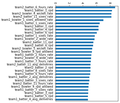
The mix of good and bad news: there’s no magical single feature that blows all the other ones out of the water in terms of their importance: good because it shows we need all the metrics we can get, and bad because it doesn’t give us a specific direction on what to focus on for developing our understanding of what matters in predicting cricket. But if we look a little closer, we can see runs per delivery appearing disproportionately in the list of important features, suggesting our boring basic stat is doing a lot of heavy lifting. This at least helps us narrow down where we should focus our future understanding: runs are runs at the end of the day, and the more we can refine our understanding of these runs, the better our metrics will be.
The last question some of you may be wondering: is this model any good? Can I take the results of this model and start hammering the books and turn it into a money printing machine? My guess is no: after all, we took some very simple metrics and haven’t done any of the numerous adjustments that enhance the predictive power of these metrics. Knowing when a model is good enough to bet into open markets is a lifetime of study: how to benchmark its accuracy, knowing when the model still holds and needs to be re-fit with additional data, etc. But at a minimum, the dispersion we see in estimated probabilities suggests we’re off to a meaningful start. For the true bettors, the finish line never really arrives, as there’s always something else that can be added to improve the model, but even those models have to start somewhere. It looks like we’ve accomplished exactly that: a good start.
I’m confident that this model can be improved upon when put in the hands of people able and willing to grind out the marginal improvements required to make this model accurate enough to be profitable. And if you’re not one of those people, but always wanted to be, this code is a great place to get your hands dirty and try some actual data exploration and modeling yourself. To that end I’m releasing the code that this series is based on here https://github.com/PrimeSportsDataScience/2024CricketModel.
I’ll see you all again when they ask me to predict rugby or something.